Screen Resolution Checker
Viewport, Ratio And Pixel Density
This screen resolution checker reads your screen size, your viewport, your device pixel ratio, your aspect ratio and your refresh rate. So open the page, and the numbers are already there. We upload nothing.
- FreePrice
- FourPanels
- NoneSign-up
- NoneUploads
Screen Resolution Checker
Your screen size, viewport, pixel ratio, aspect ratio and refresh rate
—
Your screen, in CSS pixels
- Screen size in CSS pixels
- —
- Screen size in device pixels
- —
- Space left by the system bars
- —
- Device pixel ratio
- —
- Colour depth
- —
- Total pixels
- —
- Standard name
- —
- Orientation
- —
A browser is never told which monitor you own, so there is no model name and no graphics card here. These are the numbers your own screen reports.
- Viewport, the size your CSS sees
- —
- Visual viewport, after pinch zoom
- —
- Document area
- —
- Scrollbar width
- —
- Whole window, frame included
- —
- Taken by browser chrome
- —
- Live Bootstrap breakpoint
- —
- Live Tailwind breakpoint
- —
Resize the window and these numbers follow along, because a viewport is the one reading that changes while you work.
- Ratio, reduced
- —
- Closest standard ratio
- —
- Ratio as a decimal
- —
- Diagonal in pixels
- —
- Pixels per inch
- —
- Dot pitch
- —
- Panel size, width by height
- —
- Density band
- —
No browser reports how big a panel is in inches. So density stays empty until you type the diagonal, and then every figure here follows from it.
| Resolution | Name | Total pixels |
|---|
- Measured rate
- —
- Nearest standard rate
- —
- Frames counted
- —
- How steady the run was
- —
This one is an estimate, not a specification. Because no browser states a refresh rate, the page counts animation frames for a moment and does the arithmetic. A busy tab reads low, so measure twice.
- Colour gamut
- —
- Dynamic range
- —
- Pointer
- —
- Hover
- —
- Touch points
- —
- Colour scheme you asked for
- —
- Reduced motion
- —
- Forced colours
- —
- Orientation the screen reports
- —
Reading your display.
What A Screen Resolution Checker Does For You
Screen numbers hide in three different places. Your system knows one size, the browser window knows another, and your page sees a third. So a screen resolution checker puts all three side by side, and then the gaps between them finally make sense.
There is nothing to set up. Because the page reads every value the moment it loads, your screen size, your viewport and your pixel ratio sit on screen before you touch anything.
Four panels share one page. As a result, you can move from the plain screen size to the aspect ratio, the device pixel ratio (DPR) and the refresh rate without leaving the tab.
Everything runs in your browser. So none of these readings reach this site, and we store nothing.
How The Screen Resolution Checker Works
First, the tool asks your browser for the screen object. Then it measures the window itself. Next, it divides one by the other, so the pixel ratio and the native pixel count fall out of the same two readings.

The tool guesses nothing. Because every line comes from a documented browser property, you can check each one yourself in a console if you want to.
What Is My Screen Resolution?
The headline pair is the one most people arrive for. So the top of the page shows your screen width and height, written the way a spec sheet writes them, such as 1920 by 1080.
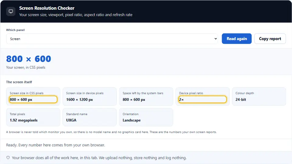
That pair comes from the screen object your browser exposes. Because the browser counts in CSS pixels, a laptop with a sharp panel often shows a smaller number than the one on the box.
CSS Pixels And Native Pixels
Two pixel counts live in every modern display. The CSS pixel is the unit your stylesheet talks in, while the native pixel is a real dot in the panel.
So the tool multiplies the CSS size by the device pixel ratio, and then it prints the native size underneath. For example, a 1512 by 982 screen at a ratio of two really holds 3024 by 1964 dots. The MDN page on window.devicePixelRatio sets out the rule browsers follow.
The Available Screen Area
Your screen is not all yours. Because a taskbar, a dock or a menu bar keeps a strip, the browser also reports an available width and height.
The tool shows both pairs, so the difference tells you how much furniture your desktop holds back. On a phone the two pairs usually match, while on a desktop they rarely do.
Colour Depth And Orientation
Two smaller readings sit in the same panel. Colour depth counts the bits per pixel, and almost every display today answers twenty-four.
Orientation says whether you sit in portrait or landscape, and it also gives the angle. Therefore a tablet that you turn updates both lines at once, as the MDN page on screen.orientation describes.
A Viewport Size Checker In The Same Page
The viewport is the part of the window your page can actually draw in. So the second panel measures it directly, and then it holds that figure against the screen size above.
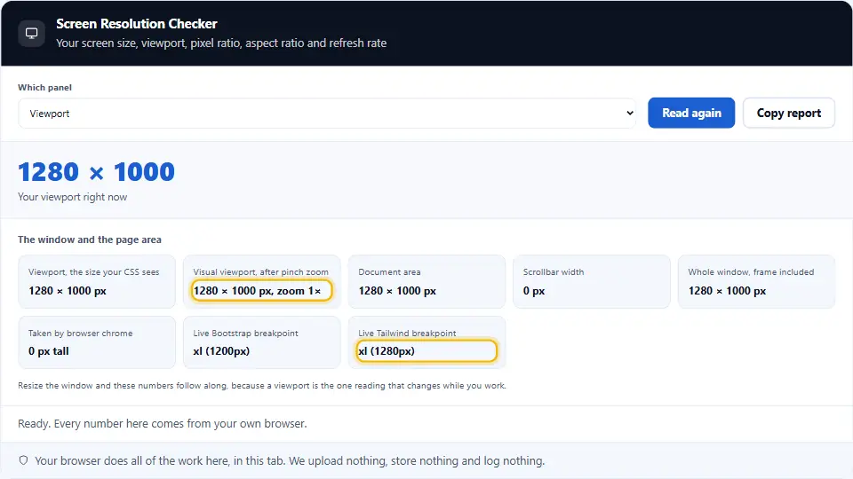
Two readings appear here. The window gives one width, while the document element gives another, and any gap between them is the scrollbar.
Sometimes that gap is zero. Because a browser with overlay scrollbars floats the bar above the page instead of reserving room for it, the panel then reports nought pixels, and the screenshot below shows exactly that case.
Why The Viewport Is Smaller Than The Screen
Browser furniture eats the rest. Because the tab strip, the address bar and the bookmarks row all sit above your page, the viewport loses a hundred pixels of height or more.
Width goes the same way once a scrollbar appears. So a maximised window on a 1920 wide screen often reports 1905 for the document, and that missing 15 is the bar itself. The rules behind both readings live in the W3C CSSOM View Module.
Which Breakpoint You Are In
Most sites change layout at a few set widths. So the tool names the band you sit in right now, from a narrow phone through a tablet to a wide desktop.
Resize the window and the label follows you. Therefore you can watch exactly where a design flips, without opening a single developer tool.
The Visual Viewport On A Phone
A phone adds one more layer. When the keyboard opens or you pinch to zoom, the part you can see shrinks even though the layout keeps its size.
The tool reports that visible box and the zoom scale beside it. For the details, see the MDN page on the VisualViewport API.
Aspect Ratio And Pixel Density
The third panel turns your two sizes into shapes. First it reduces the screen size to a ratio, and then it works out how tightly the pixels sit together.
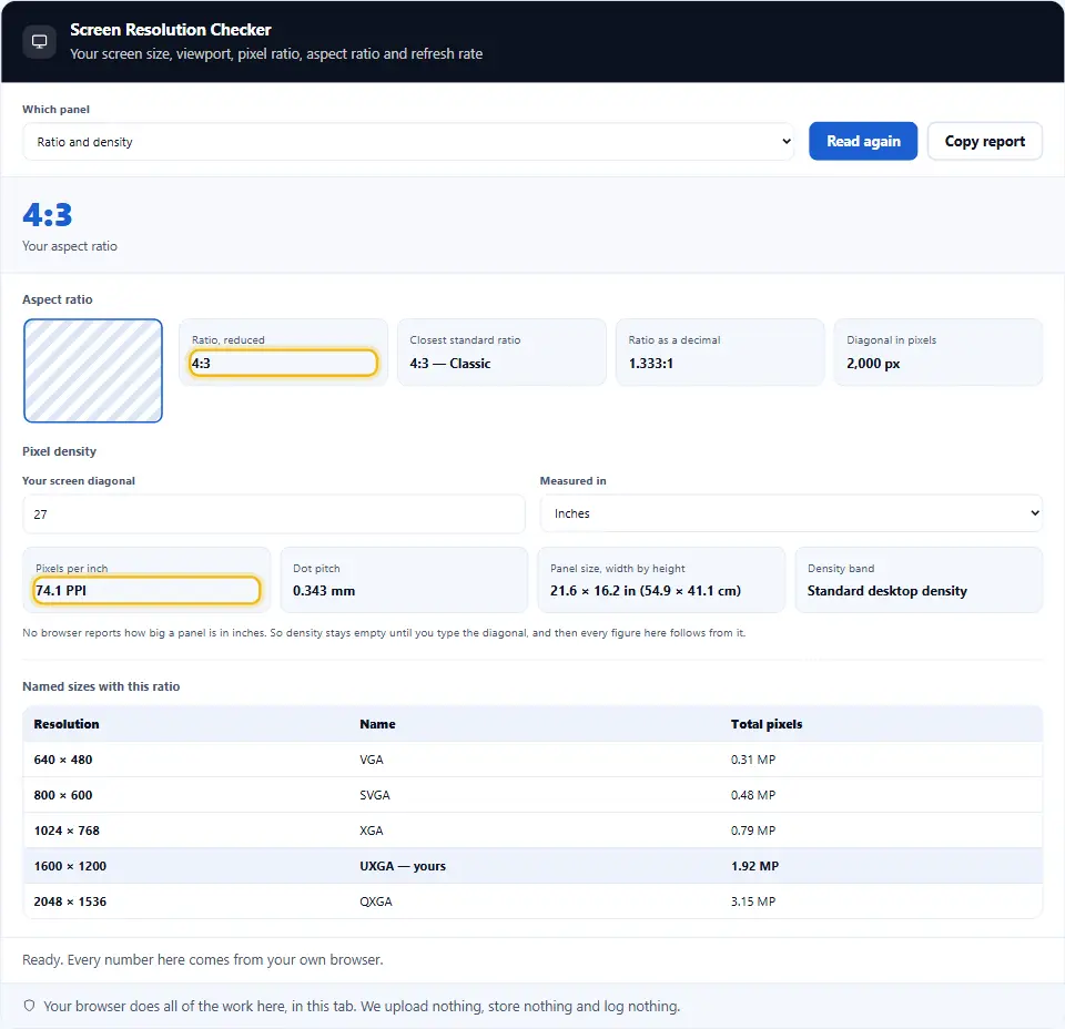
Both figures help when you choose an image or a video. For instance, a 16:9 banner fits a 1920 by 1080 screen exactly, while a 16:10 laptop leaves a band.
How The Tool Reduces The Aspect Ratio
A ratio is just a fraction in lowest terms. So the tool divides both sides by their greatest common divisor, and 1920 by 1080 becomes 16:9.
Some sizes never land on a neat pair. For example, 1366 by 768 reduces to 683:384, so the tool also names the closest common ratio beside it.
PPI Needs Your Monitor Diagonal
Pixels per inch cannot come from the browser. Because no web page may ask a panel how large it stands in inches, the figure stays blank until you type the diagonal yourself.
Enter 27 for a 27 inch monitor, and the tool does the rest. Then it divides the native diagonal in pixels by your measurement, so a 3840 by 2160 panel at 27 inches lands near 163 PPI.
Refresh Rate And Display Capability
The fourth panel asks what your display can do. So it samples the refresh rate, and then it checks the colour and contrast features your browser admits to.
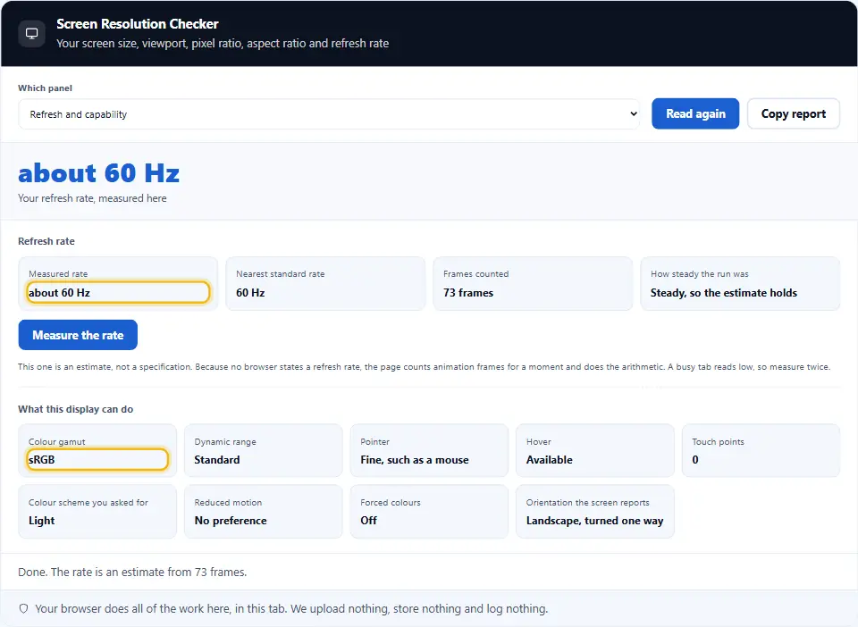
Every line here holds a browser answer, not a hardware lookup. Therefore the panel stays honest about that difference.
The Refresh Rate Is An Estimate
No browser hands out the refresh rate directly. Instead the tool counts animation frames for about a second, and then it rounds the count to the nearest common rate.
So treat the answer as close rather than exact. Because a busy tab or a battery saver drops frames, a 120 Hz panel sometimes reports 60 while it throttles. The frame callback behind the count sits on the MDN requestAnimationFrame page.
Colour Gamut And Dynamic Range
Two media queries answer the colour question. One asks whether your display covers the wider P3 space, while the other asks whether it handles high dynamic range.
A yes here means your browser claims the capability. So treat it as a hint for a CSS decision, as the MDN colour-gamut reference suggests, rather than as a calibration report.
Contrast, Motion And Pointer Hints
The same panel reads the preferences you keep in your system. Dark mode, reduced motion, higher contrast and forced colours each get a line.
Pointer and hover round it off, so a touch screen and a mouse look different straight away. All of these queries sit in the W3C Media Queries Level 5 specification.
What This Screen Resolution Checker Cannot Tell You
An honest tool names its limits. So here are the lines this page will never print, however often you refresh it.
Your monitor model stays unknown, and so does the make of your graphics card. Physical inches need your own measurement, while the refresh rate remains a sample rather than a reading from the panel.
Copy The Whole Report
One button takes everything. So press Copy report, and every panel lands on your clipboard as a plain list of labels and values.
That list pastes straight into a bug ticket. Therefore a tester can say exactly which screen, viewport and ratio produced a layout problem.
Safe By Design
The tool works in your browser. It sends nothing, and it stores nothing. So the sizes it reads, the diagonal you type and the report you copy all stay on your own device.
On this page
- The tool
- What A Screen Resolution Checker Does For You
- Using The Screen Resolution Checker, Step By Step
- What This Screen Resolution Checker Does Differently
- Habits For Reading Screen Numbers Well
- Common Mistakes With A Screen Resolution Checker
- Screen Resolution Checker Questions People Ask
- Handy Companions For Display Work
Keep going
Using The Screen Resolution Checker, Step By Step
Four steps take you from a blank tab to a full display report.
- 1
Open the page
Your screen and viewport sizes appear at once.
- 2
Pick a panel
Screen, viewport, ratio or display capability.
- 3
Add your diagonal
Only for PPI, and only if you want it.
- 4
Copy the report
One button puts every reading on your clipboard.
What This Screen Resolution Checker Does Differently
Four panels, honest limits, and numbers you can paste into a ticket.
Four panels in one page
Screen, viewport, ratio and display capability sit together.
CSS and native pixels
Both counts, so a sharp panel stops surprising you.
Live while you resize
Drag the window and every number follows at once.
Honest about limits
It never guesses your monitor model or your physical size.
One click report
Copy every reading as a plain list for a bug ticket.
Nothing leaves your tab
Your browser does the reading, so we never see it.
Habits For Reading Screen Numbers Well
A few habits make the screen resolution checker genuinely useful.
- Quote the viewport, not the screen. A layout bug follows the window size, so report that pair first.
- Give the pixel ratio too. The same viewport looks different at a ratio of one and of three.
- Test at your own breakpoints. Drag the window until the label changes, then look at the seams.
- Measure the diagonal once. Write it down, because PPI needs a number no browser can supply.
- Treat the refresh rate as a sample. Run it twice on a quiet tab before you trust the figure.
- Check the ratio before you crop. A 16:10 laptop leaves a band under a 16:9 image.
- Remember the scrollbar. It costs about 15 pixels of width on a desktop, but none on a phone.
- Paste the report into the ticket. Plain labels and values save the next person a round of questions.
Common Mistakes With A Screen Resolution Checker
Each of these turns a simple reading into a wrong conclusion.
Reporting the screen size for a layout bug
Your page never sees that figure, so give the viewport instead.
Ignoring the device pixel ratio
A 390 wide phone can hold 1170 real dots, so images need the ratio.
Expecting inches from the browser
No page may ask a panel its size, so PPI needs your diagonal.
Trusting one refresh rate sample
A busy tab drops frames, and the estimate drops with them.
Forgetting the zoom level
Browser zoom moves the ratio, so reset it before you compare.
Reading a ratio from a rounded size
A 1366 wide panel is not 16:9, however close it looks.
Screen Resolution Checker Questions People Ask
Is this screen resolution checker free?
Yes. It costs nothing, needs no account and has no daily limit. It runs in your browser, so we have no server cost to pass on.
What is my screen resolution?
Open the page and the top line answers it. The figure comes from your browser, in CSS pixels, such as 1920 by 1080.
Does anything leave my device?
No. Your browser reads every value. So nothing reaches this site, and we keep nothing.
Why is the number smaller than the box said?
Because the browser counts CSS pixels. Multiply by the device pixel ratio, and you get the native dots the panel really holds.
What is the difference between screen size and viewport?
The screen covers the whole display, while the viewport covers only the part your page can draw in. Tabs, toolbars and scrollbars take the rest.
Which one should I report in a bug?
The viewport, with the pixel ratio beside it. A layout follows those two, not the screen size.
What is a device pixel ratio?
It counts the native dots behind one CSS pixel. So a ratio of two means four real dots for every CSS pixel.
Does browser zoom change these numbers?
Yes. Zoom moves the pixel ratio and the viewport together, so reset it to 100 per cent before you compare readings.
Why is my available screen area smaller?
Because a taskbar, a dock or a menu bar keeps a strip. The tool shows both pairs, so you can see the difference.
How do I check my viewport size?
The second panel reports it live. Drag the window, and both the window figure and the document figure follow at once.
What is the scrollbar width line?
It holds the gap between the window width and the document width. On a desktop that gap sits near 15 pixels, while a phone shows none.
Which breakpoint am I in?
The tool names the band, from a narrow phone through a tablet to a wide desktop. Resize the window and the label changes with you.
How does the tool work out the aspect ratio?
It divides both sides by their greatest common divisor. So 1920 by 1080 reduces to 16:9.
Why does my ratio look odd?
Some sizes never reduce neatly. For instance, 1366 by 768 becomes 683:384, so the tool names the closest common ratio too.
Can it tell me my screen size in inches?
No. No web page may ask a panel its physical size, so type your diagonal and the tool works out the PPI from that.
What is PPI?
Pixels per inch. It divides the native diagonal in pixels by the diagonal in inches, so a 27 inch 4K panel sits near 163.
How does it measure the refresh rate?
It counts animation frames for about a second, and then it rounds to the nearest common rate. So treat the answer as an estimate.
Why does my 144 Hz monitor report 60?
Because the browser throttles frames when the tab stays busy or the battery runs low. Try it again on a quiet tab.
Does it know my monitor model?
No. The browser never shares the make or the model, and we would rather drop the line than guess it.
What does colour depth mean?
It counts the bits per pixel your display reports. Almost every screen today answers twenty-four.
Can it check a wide colour display?
Yes. One media query asks whether your display covers the P3 space, while another asks about high dynamic range.
Does it show my dark mode setting?
Yes. Dark mode, reduced motion, higher contrast and forced colours each get a line in the display panel.
Does it work on a phone?
Yes. The panels stack, the buttons stay large, and the visual viewport line also reports your zoom.
Can I save the readings?
Yes. Press Copy report, and every panel lands on your clipboard as plain labels and values.
Does it work offline?
Once the page has loaded, yes. Reading your display needs no network at all.
Handy Companions For Display Work
Knowing your screen is one step. These three help with the rest.
See your IP address, your browser and your network.
Open tool →Turn pixel values into rem for a layout that scales.
Open tool →Read the browser, engine and platform in your user agent.
Open tool →
Ready To Use The Screen Resolution Checker?
Open a panel, read the numbers, and copy the report. The screen resolution checker is free, needs no account, and keeps every reading on your own device.