Wedding Color Scheme Ideas: The Short Answer
The best wedding color scheme ideas start from one colour you already love, such as a flower, a dress or a detail at the venue. Then you add one or two colours that sit well beside it, plus a calm neutral like ivory or white. That gives you three to four colours, which is enough for every part of the day.

Below you will find twenty ready palettes with hex codes, sorted by season and by style. Each code is exact, so your florist, printer and baker can match it. You can also build a palette of your own in a minute with our free Color Scheme Generator.
We also cover where each colour goes on the day. Most couples miss this part, yet it decides if the palette looks planned or random.
How Many Colours a Wedding Needs
Most planners work with three to four colours. Fewer can look flat, and more can look busy in photos. A simple split works well for almost any wedding.
| Role | Share of the look | Where it shows |
|---|---|---|
| Main colour | About 60% | Bridesmaid dresses, table linen, florals |
| Second colour | About 30% | Suits, ties, ribbons, stationery |
| Accent colour | About 10% | Napkins, candles, cake details, signs |
| Neutral | Background | Ivory, white, cream or soft grey |
This 60-30-10 idea comes from home design. It works because the eye needs one colour to lead, one to back it up and one small spark to end the look.
Wedding Color Scheme Ideas by Season
Season is the easiest place to start. Nature sets the mood for you, so your colours look right in the room and in the light of the day.
| Palette | Season | Colours (hex) |
|---|---|---|
| Blush and sage | Spring | #E8B4B8, #A3B18A, #FFF8F0 |
| Lilac garden | Spring | #C8A2C8, #8FBC8F, #FAF7F2 |
| Peach and mint | Spring | #F6B89F, #B5E3D8, #FFFFFF |
| Coral and teal | Summer | #FF7F6E, #2A9D8F, #F4E9D8 |
| Lemon and navy | Summer | #F7E27D, #1D3557, #FFFDF5 |
| Rust and olive | Autumn | #B7472A, #6B705C, #F1E3D3 |
| Burgundy and gold | Autumn | #7B1E3A, #C9A227, #FAF3E0 |
| Terracotta and sand | Autumn | #C8553D, #E9D8A6, #FFFFFF |
| Navy and silver | Winter | #14213D, #C0C7D0, #FFFFFF |
| Emerald and champagne | Winter | #0B6E4F, #F1E1C6, #FFFAF0 |
Pastel shades are prevalent in spring palettes, more bold colors are used in the summer. Fall palettes include more earth tone colors. Cold colors are used in winter palettes with touch of metallic colors.
Palettes by Wedding Style
Different styles also need to be taken into account along with the season. A wedding held in a ballroom calls for different colors from those used in a beach wedding.
| Palette | Style | Colours (hex) |
|---|---|---|
| Dusty blue and ivory | Classic | #8DA9C4, #FFFFF0, #5C6B73 |
| Black, white and gold | Black tie | #111111, #FFFFFF, #D4AF37 |
| Sage and eucalyptus | Garden | #9CAF88, #5F7161, #F7F5EF |
| Mauve and taupe | Romantic | #B784A7, #A39887, #FBF7F4 |
| Ocean and sand | Beach | #4FA3C7, #E8D5B5, #FFFFFF |
| Burnt orange and cream | Boho | #CC5500, #F3E5C8, #8C6A4F |
| Pastel rainbow | Playful | #FFD1DC, #C1E1C1, #AEC6CF |
| Forest and copper | Rustic | #2F4F3E, #B87333, #EFE6DA |
| Royal blue and white | Formal | #1F4E9C, #FFFFFF, #C0C0C0 |
| Red and gold | Traditional | #B22222, #DAA520, #FFF5E1 |
Red and gold suit many South Asian and Chinese weddings, where these colours carry luck and joy. Always check what colours mean in your families' traditions before you print anything.
Build Your Own Palette in Three Steps
Ready palettes are a great start, but your own colours will feel more like you. A wedding color scheme generator makes this fast and keeps the colours in balance.
Step 1: Start From One Colour
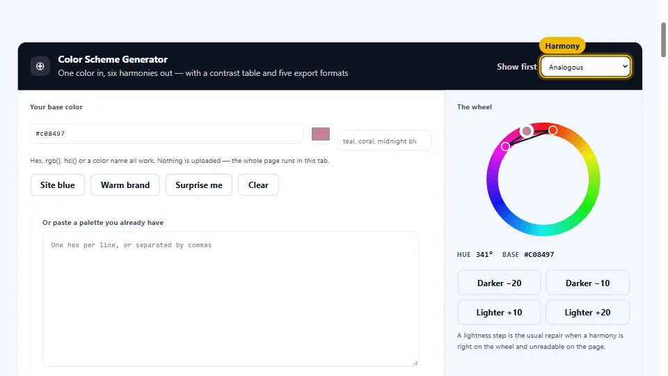
Open the Color Scheme Generator and enter one colour. It can come from a fabric swatch, a flower or a photo of the venue. If you have a hex code, type it; if not, pick the colour by eye.
Step 2: Choose a Harmony
The harmony sets the mood. Analogous colours sit side by side on the colour wheel, so they feel soft and romantic. Complementary colours sit opposite each other, which feels bold and modern. A one-colour scheme uses shades of a single hue, and it looks calm and neat.
Step 3: Check It Before You Print
Invitations, menus and signs need text that people can read. The contrast check shows which pairs are easy to read, so a pale blush never ends up as the text colour on ivory card.
If you love a photo, load it into the generator. Its main colours become a palette, which is a quick way to turn a mood board into real codes.
Where Each Colour Goes on the Day
A palette only works when everyone uses it the same way. Share a short list like this with your suppliers.
| Supplier | What to send | Tip |
|---|---|---|
| Florist | Main and second colour | Ask for one bloom in the accent colour |
| Stationer | Neutral card, second colour text | Check contrast before proofs |
| Bridal party | Main colour | Allow shades within one colour |
| Baker | Neutral icing, accent details | Send the hex code and a fabric swatch |
| Venue stylist | All four colours | Share the 60-30-10 split |
When sending codes obstructions are justified. Incl included a sample of the fabric to remove guess work as to what colors will really look like.
A Real Case: One Bridesmaid Dress, One Palette
A couple in Manchester had only one fixed point: the bridesmaids had already bought dusty pink dresses. They wanted the rest of the wedding to match, but every colour they tried looked either too sweet or too dull.
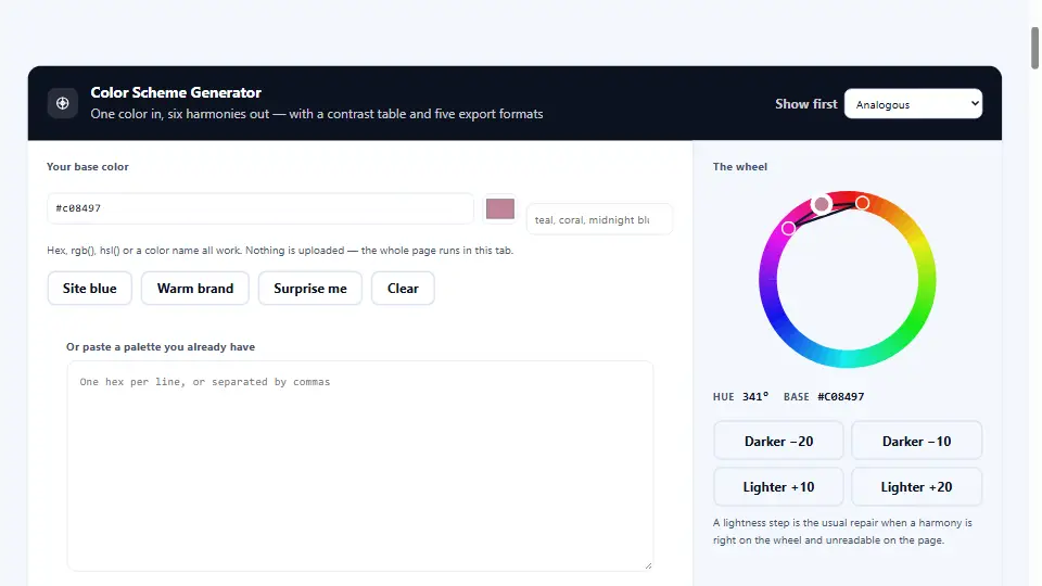
They photographed the dress fabric in daylight and loaded the photo into the generator. The main colour came out as #C08497. An analogous harmony added a soft lilac and a muted rose, and they chose ivory as the neutral.
The contrast check showed that the pink failed as text on ivory, so the stationer used a deep plum from the same palette instead. The florist matched the codes, and the photos looked planned from start to finish.
| Role | Colour | Hex |
|---|---|---|
| Main | Dusty pink (dresses, flowers) | #C08497 |
| Second | Soft lilac (ribbons, linen) | #B8A1C9 |
| Accent | Deep plum (text, details) | #5E3A55 |
| Neutral | Ivory (card, cake) | #FFFFF0 |
Common Mistakes to Avoid
To avoid these issues with your palette check this list first.
- Too many colours: five or more strong colours look busy in photos.
- Picking colours on a phone only: screens shift colours, so always see a printed swatch.
- Pale text on pale card: guests cannot read the date or the address.
- Ignoring the venue: a red carpet or green walls are part of your palette too.
- No neutral: without white, ivory or cream, strong colours have nowhere to rest.
In short: start from one colour, pick a harmony, keep to three or four colours and check every pair before it goes to print. For more on colour combinations, the Canva colour wheel guide explains each harmony with examples.
Questions and Answers
What are some tips for choosing a wedding color scheme?
Choose a color you really like, maybe a color found in a flower or in your wedding dress. Add two colors to create a base for your scheme. Ivory would be a good choice for a neutral.
How many colours should a wedding have?
Three to four works best: a main colour, a second colour, a small accent and a neutral.
What is the 60-30-10 rule for weddings?
About 60 percent main colour, 30 percent second colour and 10 percent accent. It keeps the look balanced.
What are popular spring wedding colours?
For a spring wedding, colors such as blush and sage or mint may be nice to use.
What are good autumn wedding colours?
Some good color schemes for autumn would be rust and olive rim, burgundy and gold.
What colours work for a winter wedding?
Metal primed colors would be good to use with deep colors like navy.
What colours suit a beach wedding?
The colors of a sand, ocean, and white wave crest add great atmosphere to a beach wedding.
Can I use a color scheme generator to pick colors for my wedding?
Sure. Enter one color of your choice to get a harmonious color scheme.
What is an analogous colour scheme?
Colours that sit next to each other on the colour wheel. They look soft and calm.
What is a complementary colour scheme?
Colors at opposite ends of the wheel create a scheme that is bold and modern.
Can I take colors from this photo to use in my wedding?
Yes. The generator will extract the colors in the picture and create a color scheme for you.
Why do I need hex codes?
Florists, printers and bakers, etc, will thank you for giving them the hex code to represent the color in your palette.
Should the bridesmaid dresses match exactly?
Relaxed colors within the same palette are still good to use in pictures to tie them together.
Which colors should I avoid using on my invitation text?
Pale colours on light card. Check contrast and use a deep colour from your palette for text.
Is white required as a neutral?
Ivory, cream and very light shades of grey make good choices as well.
Do venue colours matter?
Yes. Use the colors of the carpet, walls and chairs in each picture to create a color scheme for each image.
What colours mean luck in weddings?
Red and gold are thought to bring good luck in many Chinese and South Asian cultures. Check with family to be sure.
How early should we pick wedding colours?
Best before you book the florist and order the cards, often six to nine months ahead.
Is it possible for a palette to change with the season?
Yes. Keep the main colour and swap the accent, such as coral in summer and rust in autumn.
Is the colour scheme generator free?
Yes. It’s free, easy to use, and doesn’t require you to sign up or create an account of any kind.