Color Contrast Checker
Test Text And Background Colors
This free color contrast checker gives the WCAG contrast ratio of any two colors as you type. It shows each AA and AAA result, then offers the nearest color that passes. You also see the pair as people with color blindness see it.
- FreePrice
- WCAG 2.2 AA and AAAStandard
- Up to 12 colorsPalette grid
- NoneSign-up
Color Contrast Checker
WCAG 2 ratio, AA and AAA, with fixes and a color blindness preview
Type hex, rgb(), hsl() or a CSS color name. A see-through text color, such as #00000080, is blended onto the background first.
5.82:1
Passes AA for all text. Short of AAA for normal text.
- Normal text AA (4.5:1)Pass
- Normal text AAA (7:1)Fail
- Large text AA (3:1)Pass
- Large text AAA (4.5:1)Pass
- Icons and borders (3:1)Pass
Normal text at 16px reads like this paragraph.
Large text at 24px
Bold text at 19px counts as large
Button
APCA reading (WCAG 3 draft): Lc 78.5fine for text of 18px and up
Nearest colors that pass
This pair already passes AAA, so there is nothing to fix.
| Vision | Preview | Ratio |
|---|---|---|
| Protanopia (no red cones) | Aa | 5.01:1 |
| Deuteranopia (no green cones) | Aa | 6.05:1 |
| Tritanopia (no blue cones) | Aa | 4.96:1 |
| Achromatopsia (no color at all) | Aa | 5.82:1 |
Rows are the text color and columns are the background. AAA means 7:1, AA means 4.5:1 and AA+ means 3:1, which is enough for large text only.
Ready. Change either color and the result updates as you type.
What This Color Contrast Checker Tells You
Contrast is the gap in brightness between two colors. When the gap is small, words fade into the page. So people with low vision, people on a phone in the sun, and anyone with tired eyes struggle to read them.
This color contrast checker measures that gap the way the Web Content Accessibility Guidelines do. First, you type or pick a text color and a background color. Then the tool works out the ratio, from 1:1 for two equal colors up to 21:1 for black on white. Finally, it says which WCAG levels the pair passes.
The rules come from the WCAG 2.2 contrast success criterion. Normal text needs 4.5:1 for level AA, while large text needs 3:1. In addition, icons, borders and form fields need 3:1 against what sits next to them.
Everything runs in your browser tab. So the colors you test never reach our server, and you can check a brand palette before it goes public.
How The Contrast Ratio Is Worked Out
Each color first becomes a relative luminance, a number from 0 for black to 1 for white. The formula weights green most and blue least, because our eyes react to green light far more than to blue.

Next, the tool adds 0.05 to both values and divides the lighter one by the darker one. That gives the contrast ratio. The order of the two colors does not change it, so a swap gives the same number.
Our color contrast checker never rounds a ratio up. A pair at 4.499:1 shows as 4.49:1 and fails, because WCAG treats the thresholds as exact lines.
AA, AAA And Large Text In Plain Words
Level AA is the target most laws and contracts name. Normal text needs 4.5:1, and large text needs 3:1. Level AAA is stricter, at 7:1 for normal text and 4.5:1 for large text.
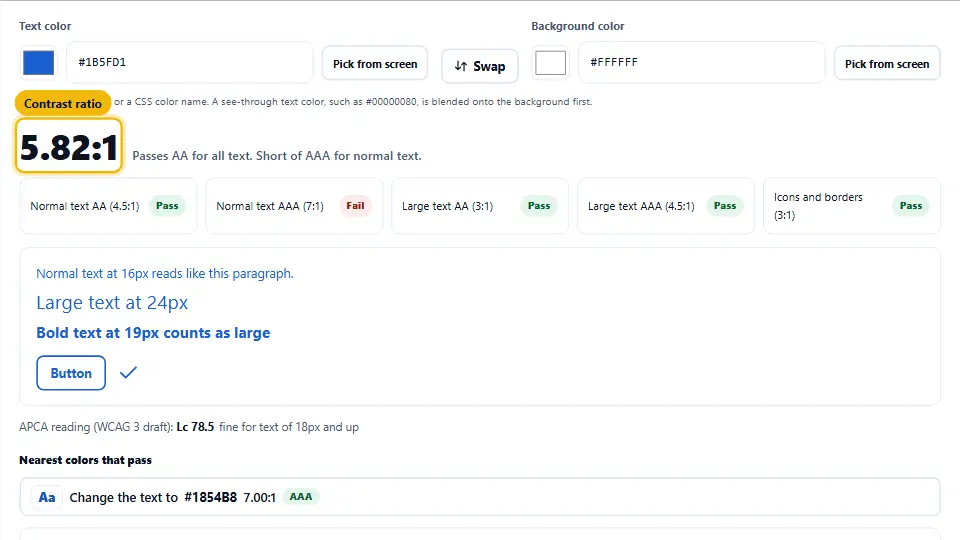
Large means at least 24px, or at least 18.66px when the text is bold. Those numbers come from 18 point and 14 point type. So a 16px paragraph always counts as normal text, even in a heading style.
The tool shows all five results at once, each with a pass or fail label. Therefore you can see at a glance whether a color works only for a big headline or for body copy too.
Nearest Colors That Pass
A failing result is only half an answer. So the tool also looks for the closest color that would pass, for AA and for AAA. It keeps the hue and the saturation, and it moves only the lightness.
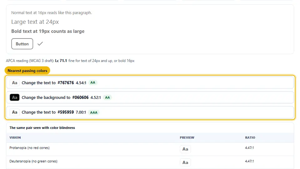
You get two kinds of fix. One changes the text color, and the other changes the background. For example, gray #777777 on white fails at 4.47:1, while #767676 passes at 4.54:1. One click applies a fix, and every result updates.
Color Blindness And The APCA Reading
A table below the result shows your pair as four types of color blindness: missing red, green or blue cones, and no color at all. Each row has its own ratio. Red on green is the classic trap, since both colors can look like the same brown.
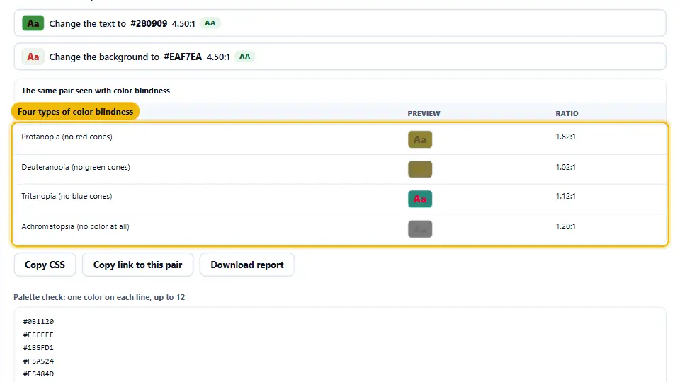
The tool also gives an APCA reading, the method in the WCAG 3 working draft. Its Lc number cares about which color sits on top, so white on black and black on white score differently. However, APCA is still a draft, so treat it as a second opinion and keep the WCAG 2 result as your pass mark.
A Palette Grid For Whole Design Systems
Most teams pick from a palette rather than from two colors. So the second panel takes up to 12 colors, one on each line, and tests every pair at once.
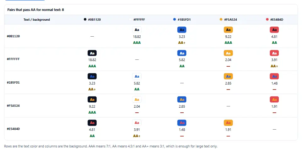
Rows hold the text color and columns hold the background. Each cell shows a small sample, the ratio and a grade: AAA, AA, AA+ for large text only, or a dash for a fail. As a result, you can see which pairs are safe for body text before anyone builds a page.
See the Color Contrast Checker at Work, Start to Finish
This brief video shows each step from start to finish. Choose your language below, and switch on captions if they help.
Using the color contrast checker, step by step
Five quick steps take you from two colors to a pair you can ship.
Enter the text color
Type a hex code, rgb(), hsl() or a color name, or click the swatch to pick one.
Enter the background
Add the color behind the text. In Chrome and Edge, Pick from screen grabs any pixel.
Read the ratio
The big number and the five labels show what the pair passes. The preview shows it at three sizes.
Apply a fix
If the pair fails, click one of the nearest passing colors. Then check the preview again.
Save the result
Copy the CSS, copy a link to the pair, or download a short report for your notes.
Why use this WCAG contrast checker
A bare ratio tells you less than you need. These three extras close the gap.
It suggests the fix
You do not have to guess a darker shade. The tool finds the closest passing color for both sides of the pair.
It handles see-through colors
A text color with opacity, such as #00000080, gets blended onto its background first. So the ratio matches what the screen shows.
It checks a whole palette
Paste up to 12 colors and every pair gets a grade. That turns an afternoon of single checks into one click.
The contrast lines WCAG draws
Three numbers cover almost every case on a web page.
- 4.5:1 for normal text This is level AA for body copy, links, labels and placeholder text. AAA asks for 7:1.
- 3:1 for large text Text of 24px, or 18.66px in bold, passes AA at 3:1. AAA for large text asks for 4.5:1.
- 3:1 for icons and borders Since WCAG 2.1, form field edges, focus rings and meaningful icons need 3:1 against their neighbors.
Contrast mistakes that fail an audit
Each of these passes a quick look and still fails a real test.
Light gray placeholder text
Placeholder text is still text, so it needs 4.5:1 too. The pale default in many themes fails.
Text on a photo
A photo has light and dark areas. So test the text against the lightest area it covers, or add a solid overlay.
Trusting color alone
A red error with no icon or word fails people who cannot see red. Pair the color with a label.
Forgetting hover and focus
A link can pass at rest and fail on hover. Check every state, including the focus ring.
Rounding up the ratio
Some tools show 4.5 for a pair at 4.48. WCAG does not round, so that pair fails.
Checking only the light theme
A brand blue that passes on white can fail on a dark background. Test both themes.
Color contrast checker questions people ask
What is a good contrast ratio for text?
Aim for at least 4.5:1 for normal text, which is WCAG level AA. For long reading, 7:1 or more is better, and that is level AAA.
Is this color contrast checker free?
Yes. It is free, it needs no account, and it has no limit on how many pairs you test.
Does it send my colors anywhere?
No. The whole check runs in your browser tab, so your colors never reach our server.
Is a colour contrast checker the same tool?
Yes. Colour is the British spelling, so a colour contrast checker does exactly the same job as this page.
What counts as large text?
Text of at least 24px, or at least 18.66px when it is bold. Those sizes match 18 point and 14 point type.
Which formats can I type?
Hex with 3, 4, 6 or 8 digits, rgb(), rgba(), hsl(), hsla() and the CSS color names, such as navy or tomato.
How does it handle transparency?
A see-through text color gets blended onto the background before the check. A see-through background gets blended onto white first.
Why does the tool show 4.49 and not 4.5?
The ratio is cut to two decimals, never rounded up. So a pair just under the line shows a number under the line, and it fails.
Does swapping the colors change the ratio?
No. The WCAG ratio is the same either way. However, the preview and the APCA reading change, because APCA cares which color is on top.
What is APCA?
APCA is the contrast method in the WCAG 3 working draft. It gives an Lc score that depends on text size and on which color sits on top.
Should I follow APCA or WCAG 2?
Follow WCAG 2 for compliance today, because laws and audits refer to it. Use APCA as an extra hint, since it is still a draft.
Do icons and buttons need contrast too?
Yes. WCAG 2.1 added a 3:1 rule for icons, form field borders, focus rings and other parts people need to see.
Does a disabled button need to pass?
No. WCAG exempts inactive controls. Still, keep them readable, because people need to know the control exists.
What about logos and decorative text?
Logos and pure decoration are exempt. Any text that carries meaning, even small print, still needs to pass.
How do the suggested fixes work?
The tool keeps the hue and saturation and moves only the lightness. It then picks the closest step that reaches AA or AAA.
Can I pick a color from my screen?
Yes, in Chrome and Edge. The Pick from screen button uses the browser eyedropper. Other browsers can use the swatch or a typed code.
What does the color blindness table show?
It shows the pair as people with missing red, green or blue cones see it, and with no color vision at all. Each row has its own ratio.
How common is color blindness?
About 1 in 12 men and 1 in 200 women have some form of color vision deficiency. Red and green confusion is the most common type.
Can I test a whole palette?
Yes. Paste up to 12 colors in the palette panel, one on each line, and press Check every pair to get a graded grid.
How do I test text on a gradient or a photo?
Pick the lightest point behind light text, or the darkest point behind dark text. If the worst point passes, the rest passes too.
Is WCAG contrast a legal requirement?
In many places, yes. US Section 508 and the EU standard EN 301 549 both refer to WCAG level AA, and courts often look at it under the ADA.
Did WCAG 2.2 change the contrast rules?
No. WCAG 2.2 kept the same contrast numbers as WCAG 2.1, so a pair that passed before still passes.
Why do other tools give a slightly different number?
Some round to one decimal, and some use an older cut-off in the formula. The difference is tiny, but it can flip a pair sitting right on a line.
Can I share a result?
Yes. Copy link to this pair gives an address that opens this page with the same two colors filled in.
Does this replace a full accessibility audit?
No. This WCAG contrast checker covers color only. A full audit also checks keyboard use, headings, alt text and much more.
More free color and design tools
Use these with the color contrast checker to build and test a palette.
- Color Code Picker
Convert a color between hex, RGB, HSL and CMYK.
- Color Scheme Generator
Get six harmonies from one starting color.
- Image Alt Text Checker
Find images with missing or weak alt text.
- Readability Score Checker
See how easy your copy is to read.
Run the color contrast checker now
Type two colors and see the ratio, the WCAG result and the nearest fix in seconds. No account stands in the way.