Line Graph Maker
Show How Numbers Change Over Time
This line graph maker creates a clean line chart from your labels and values. You can draw one line or several, a smooth curve, a shaded area or a scatter plot. Then download it as a PNG or SVG, and your data never leaves your device.
- FreePrice
- Line, curve, area, scatterStyles
- PNG + SVGExport
- NoneUploads
Line Graph Maker
Type your numbers, watch the trend appear
One point per line: a label such as a month or a year, then a value. Add more value columns for more lines. A first line of names becomes the legend.
- Points
- 6
- Lines
- 2
- Largest value
- 2,240
| Label | Visitors | Sign-ups |
|---|---|---|
| Jan | 1,240 | 310 |
| Feb | 1,580 | 420 |
| Mar | 1,320 | 380 |
| Apr | 1,910 | 520 |
| May | 2,240 | 610 |
| Jun | 2,050 | 640 |
The chart redraws as you type. Download it when it looks right.
What This Line Graph Maker Does
A line graph joins points with one line, so people can spot a pattern at once. It shows if a value goes up, goes down or stays the same. That makes it the best chart for anything that changes over time, such as sales, visitors or temperature.
Type one label and one value per row, or paste columns from a spreadsheet. Then the line graph maker draws the chart for you, with an axis, gridlines and a dot on every value. Add more value columns, and each one becomes its own line with its own color.
It also works as a free scatter plot maker. When all your labels are numbers, such as hours or years, the tool places every point on a real number line. So you can see if two things move together, for example study time and test scores.
Everything happens in this browser tab. There is no account, no upload and no watermark. Since your data never goes to a server, you can chart private sales or survey results without worry. To learn more about this type of chart, see the line chart article on Wikipedia.
From A Table To A Trend Line
The picture below shows the whole idea. On the left is a short list of months and visitors. On the right, the line graph maker has joined the six values into one line.

Each point stands for one value, and the line between points shows the change. So a steep line means a fast rise, while a flat line means little change.
Several Lines, Curves And Areas
Add more value columns, and the tool draws more lines. For example, a row like "Jan, 1240, 310" plots one point for visitors and one for sign-ups. Also, a first row of names, such as "Month, Visitors, Sign-ups", becomes the legend.
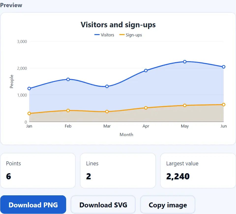
You can also pick a smooth curve, or fill the space under each line. A filled area makes the size of each value easy to feel. On the other hand, a curve looks softer on a slide.
Scatter Plots With A Real Number Line
Choose "Points only (scatter)" to show single points without a line. When the labels are numbers, the gaps between points follow the real distances. For example, 2.5 hours sits right between 2 and 3.
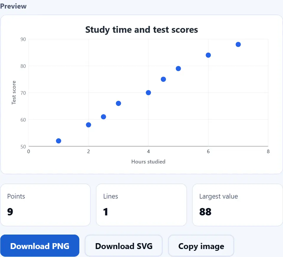
For close values, untick "Start the axis at zero". Then the axis fits your data, and small changes become easy to see.
Watch the Line Graph Maker in Action
A short video walks through every step. Then pick your language below, and turn on captions if you like.
How to make a line graph
Six short steps. Your data stays in this tab the whole time.
- 1
Enter your data
Put one point on each line: a label, a comma, then a value. You can also paste columns from Excel or Google Sheets.
- 2
Add more lines if you like
Add a second or third value column for more lines. Then a first line of names turns into the legend.
- 3
Pick a style
Choose straight lines, a smooth curve, a filled area or points only. Next, pick a size: wide, standard, square or tall.
- 4
Write a title and axis labels
A short title says what the graph shows. Then the axis labels name the time steps and the unit, such as "Month" and "Visitors".
- 5
Set the details
Turn dots, numbers, gridlines and the legend on or off. Also decide if the value axis starts at zero, and pick a color for each line.
- 6
Download or copy the graph
Save a PNG for documents and slides, or an SVG that stays sharp at any size. Copy image puts the PNG on your clipboard instead.
Why use this line graph maker
Three reasons it beats a spreadsheet chart wizard for one quick graph.
A clean graph in seconds
A spreadsheet needs a range, a chart wizard and many clicks. Here, you paste the rows and the line appears at once. So a quick graph for a report, a lesson or a post takes less than a minute. Also, every change shows up right away.
Your numbers stay private
Many chart sites ask you to sign up, and then they keep your data on their servers. This line graph maker is different. Your own browser draws the graph, and nothing is uploaded, stored or logged. As a result, sales figures or test results stay on your computer.
Files that work anywhere
You get a normal PNG image or a standard SVG file. Both open in every browser and in apps such as Word, PowerPoint, Google Docs and Canva. In addition, the SVG stays sharp at any size, so it looks clean on a big screen or in print.
How the line chart maker reads and draws your data
Three rules decide what you see. Knowing them saves surprises.
- Each line of text is one point The tool splits each line on the mark that most lines use: a tab, a semicolon or a comma. The first part is the label, and each part after it is a value for one series. It reads numbers such as 1,234.5, 1.234,5, $40 and 12%. However, a line without any number is skipped, and the status line names it.
- Labels decide the x axis If every label is a number, such as 2019 or 2.5, the x axis becomes a real number line. Otherwise the labels are spread out evenly, in the order you typed them. Also, when a row has other values, a blank value leaves a gap in its line, so the graph never invents a number.
- Preview and file come from the same drawing The page builds one list of shapes and text. Then it uses that same list for the preview, the PNG and the SVG. Therefore the file you save looks exactly like the preview. If a number changes later, edit the data and save again.
Common line graph mistakes to avoid
Each of these makes a line look fine while it tells the wrong story.
Joining things that are not in order
A line suggests a path from one point to the next. So use it for time or steps, and use bars for separate groups.
Too many lines
Six crossing lines turn into spaghetti. Instead, keep two or three, and make the most important one stand out.
Hiding the zero without saying so
A fitted axis makes small changes look big. That is fine for close values, but say so in the title or axis label.
Uneven time steps
Years like 2019, 2020 and 2024 are not evenly spaced. So type them as plain numbers, not as text like FY2019, and the real gaps show.
Mixing units
Dollars and counts on one axis mislead people. Keep one unit, and name it in the axis label.
No title or labels
A bare line makes people guess. But a short title and clear axis names fix that at once.
Line graph maker frequently asked questions
Is this line graph maker free?
Yes. There is no price, no trial, no sign-up and no watermark. Because your browser does the work, there is no server cost to pass on.
Does the tool upload my data?
No. The graph is drawn inside this tab, so your labels and values stay on your computer. Also, the page keeps nothing after you close it.
What is a line graph?
A line graph joins data points with a line. It shows how a value changes over time or across steps, so trends are easy to see.
Is a line graph the same as a line chart?
Yes. Both names mean the same chart. Some people also call it a line plot.
How do I paste data from Excel or Google Sheets?
Select the columns in your sheet, copy them, and paste them into the data box. The tab between the cells tells the tool where each value starts.
Can I draw more than one line?
Yes. Add a value column for each line, for example "Jan, 1240, 310". A header line such as "Month, Visitors, Sign-ups" names the lines in the legend.
How many lines can one graph hold?
Up to six value columns. Still, two or three lines read best, because crossing lines get hard to follow.
Can I make a scatter plot?
Yes. Pick "Points only (scatter)" under Style. When your labels are numbers, each point sits at its real place on the x axis.
Why are my years spaced unevenly?
Because the tool reads them as numbers and keeps the real gaps. For example, 2020 and 2024 sit four steps apart, not one.
Can I draw a smooth curve?
Yes. Choose "Smooth curve" under Style. The curve passes through every point, so it never hides a value.
What is an area chart?
An area chart is a line graph with the space under the line filled in. Pick "Area (filled)" to make one.
What happens to an empty value?
In a row with other values, the empty one leaves a gap, and the line starts again after it. A row with no number at all is skipped. So the graph never invents a number.
Should the axis start at zero?
For most charts, yes. However, for values that are close together, untick "Start the axis at zero" to see small changes.
Does it handle negative numbers?
Yes. The axis goes below zero, and a darker line marks the zero level. You can type -3 or (3) for minus three.
Can I show the number on each point?
Yes. Tick "Number on each point". Then every value appears just above its dot.
Can I hide the dots?
Yes. Untick "Dots on each value" for a clean line. In scatter style the dots always stay, because they are the chart.
Can I change the line colors?
Yes. Every line has a color picker in the list under the fields. Change one, and the graph redraws at once.
Can I show money or percent signs?
Yes. Type a sign such as $ in "Text before numbers", or a sign such as % in "Text after numbers".
What is the difference between PNG and SVG?
A PNG is an image made of pixels, and it works everywhere. An SVG is made of shapes and text instead, so it stays sharp at any size.
Can I save a graph with a transparent background?
Yes. Set "Background" to transparent before you download. The checkered pattern in the preview shows the empty areas.
How do I copy the graph into a document?
Press "Copy image", then paste it into your document, slide or chat. If your browser blocks this, use "Download PNG" instead.
Which size should I pick?
Use wide for slides and websites, and standard for documents. Then pick square for most social posts, and tall for phone stories.
Does the tool save my graph for next time?
No. Nothing is kept after you close the tab. So download the graph, or keep a copy of your data rows, before you leave.
Does it work on a phone?
Yes. On a small screen, the preview sits above the fields, so you see every change at once.
Does it work offline?
Yes, once the page has loaded. The tool never contacts a server to draw or save a graph.
Should I use a line graph or a bar graph?
Use a line for change over time or across steps. Use bars to compare separate groups, such as products or countries.
More tools for data and images
A few pages that pair well with a chart.
Compare values with vertical or horizontal bars.
Open tool →Show the parts of a whole as a pie or a donut.
Open tool →Fix a messy table before you chart it.
Open tool →Turn the PNG into a smaller WebP or JPG.
Open tool →Pull the rows out of an Excel file first.
Open tool →
Make your line graph now
Paste your rows, pick a style and save the graph. The line graph maker is free, and your data never leaves your device.