Pie Chart Maker
Show The Parts Of A Whole
This pie chart maker turns the labels and amounts you enter into a clear pie or donut chart. It works out every percentage for you. Then you download the chart as a PNG or SVG, and no data ever leaves your computer.
- FreePrice
- Pie, donut, halfShapes
- PNG + SVGExport
- NoneUploads
Pie Chart Maker
Type your parts, watch the whole take shape
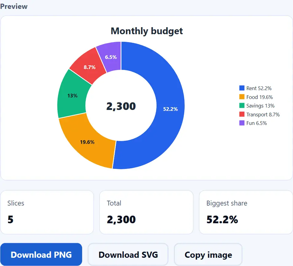
One slice per line: a label, then a number. The numbers do not need to add up to 100; each slice shows its share of your total.
- Slices
- 5
- Total
- 2,300
- Biggest share
- 52.2%
| Label | Amount | Share |
|---|---|---|
| Rent | 1,200 | 52.2% |
| Food | 450 | 19.6% |
| Savings | 300 | 13% |
| Transport | 200 | 8.7% |
| Fun | 150 | 6.5% |
The chart redraws as you type. Download it when it looks right.
What This Pie Chart Maker Does
A pie chart shows how one whole breaks down into parts. Each slice is one part, and its size is that part's share of the whole. So you can spot the biggest part at a glance and compare it with the rest.
Type one label and one amount per line, or paste two columns from a spreadsheet. The pie chart maker then adds up the total and turns every amount into a percentage. Your numbers do not need to add up to 100. For example, rent 1,200 and food 450 work just as well as 60% and 40%.
You can draw a full pie, a donut with a hole in the center, or a half donut. It also works as a free percentage pie chart maker, because each slice can show its percent, its value or both. When you are done, save it as a PNG image or an SVG file.
Everything takes place in this browser tab. There is no sign-up, no upload and no watermark. Since none of your data leaves your computer, you can chart a private budget or survey results without worry. To learn more about this type of chart, see the pie chart article on Wikipedia.
From Amounts To Shares Of A Pie
The image below shows the whole idea. On the left is a small budget with five items. On the right, the pie chart maker has turned those five items into five slices.

First, the tool adds up all the amounts to find the total. Then each amount takes its share of the circle. For example, rent is 1,200 of 2,300, so it fills about 52% of the pie.
Pie, Donut And Half Donut Charts
A donut chart is a pie chart with a round hole in the middle. The hole can hold a short text, such as the total or a word like "Budget". As a result, people see the big number and its parts in one picture.
A half donut uses only the top half of the circle. It works well for a progress score or a vote split, and it fits into a wide slide. In other words, this tool also works as a donut chart maker.
Labels, Colors And The First Slice
Each slice can show its percent, its value, both, or no label at all. If a slice is too thin for its text, the tool leaves the label off, and the legend still shows it.
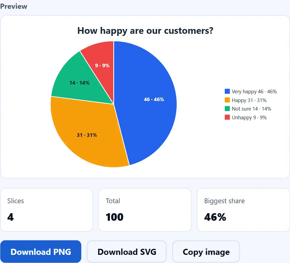
You can also choose the color of every slice. Then turn the pie so the first slice starts where you want. That way, the most important part sits in the best spot.
Watch the Pie Chart Maker in Action
A short video walks through every step. Then pick your language below, and turn on captions if you like.
How to make a pie chart
Six short steps. Your data stays in this tab the whole time.
- 1
Enter your data
Put one slice on each line: a label, a comma, then an amount. You can also paste two columns from Excel or Google Sheets.
- 2
Check the table
The table under the preview shows every slice with its amount and its share of the total. So a typo shows up before you save anything.
- 3
Pick a shape and a size
Choose a pie, a donut or a half donut. Next, pick a size: square for posts, wide for slides, standard or tall.
- 4
Choose the labels
Show the percent, the value, both, or no labels. Also add a title, so people know what the whole stands for.
- 5
Set the colors and the order
Give each slice its own color. Then keep the biggest slice first, or turn that off to keep your own order.
- 6
Download or copy the chart
Save a PNG for documents and slides, or an SVG that stays sharp at any size. If you press Copy image instead, the PNG goes to your clipboard.
Why use this pie chart maker
Three reasons it beats a spreadsheet chart wizard for one quick pie.
The math is done for you
You do not have to work out any percentages. The tool adds up the total and gives every slice its exact share. It even rounds the labels so they add up to exactly 100%, never 99.9% or 100.1%. As a result, the chart is right the first time.
Your numbers stay private
Most chart sites ask you to sign up, and then they keep your data on their servers. This pie chart maker does not. Your own browser draws the chart, and nothing is uploaded, stored or logged. So a family budget or client figures stay on your computer.
Files that work anywhere
You get a normal PNG image or a standard SVG file. Both open in every browser and in apps such as Word, PowerPoint, Google Docs and Canva. Also, the SVG stays sharp at any size, so it looks clean on a big screen or in print.
How the pie chart maker reads and draws your data
Three rules decide what you see. Knowing them saves surprises.
- Each line is one slice The tool splits each line on the mark that most lines use: a tab, a semicolon or a comma. The first part is the label, and the next part is the amount. It reads numbers such as 1,234.5, 1.234,5, $40 and 12%. However, a pie only uses the first value column, because it shows one whole.
- Slices are shares of your own total The tool adds up all the amounts, then divides each one by that sum. So the amounts can be dollars, votes or hours, and they do not need to add up to 100. But zero and negative amounts cannot be a slice. They are left out, and the status line says so.
- Preview and file come from the same drawing The page builds one list of shapes and text. Then it uses that same list for the preview, the PNG and the SVG. Therefore the file you save looks exactly like the preview. If a number changes later, edit the data and save again.
Common pie chart mistakes to avoid
Each of these makes a pie look fine while it tells the wrong story.
Too many slices
Twenty thin slices are hard to read. So keep the top five or six, and put the rest into one "Other" slice.
Parts that are not one whole
A pie needs parts of the same total. If people could pick more than one answer, use a bar graph instead.
Comparing close values
The eye cannot tell 24% from 26% in a pie. For close values, bars work much better.
Using a pie for a trend
A pie shows one moment. To show change over months, use a line or bar chart instead.
Look-alike colors
Two shades of the same blue blur together. So pick colors that clearly differ, next to each other.
No total or title
Shares mean little without the whole. Add a title, or put the total in the middle of a donut.
Pie chart maker frequently asked questions
Is this pie chart maker free?
Yes. It is a pie chart maker for free, with no price, no trial, no sign-up and no watermark. Because your browser does the work, there is no server cost to pass on.
Does the tool upload my data?
No. The chart is drawn inside this tab, so everything you type stays on your computer. Also, nothing is left behind when you close the page.
What is a pie chart?
A pie chart is a circle cut into slices. Each slice shows one part, and its size matches its share of the whole.
Do my numbers need to add up to 100?
No. Type the real amounts, such as dollars or votes. The tool adds them up and works out each share for you.
How does the tool work out the percentages?
It divides each amount by the total of all amounts. Then it rounds every label to one decimal, so together the labels add up to exactly 100%.
How do I paste data from Excel or Google Sheets?
Select two columns in your sheet, copy them, and paste them into the data box. The tab between the cells tells the tool where each label ends.
What is a donut chart?
A donut chart is a pie chart with a hole in the center. The hole can hold the total or a short phrase. To make one, pick "Donut (ring)" under Shape.
What is a half donut chart?
It is a donut cut in half, so the slices fill a half circle. It suits scores, vote splits and wide slides.
What text goes in the middle of a donut?
By default, the total of all amounts. However, you can type your own short text in "Text in the middle (donut)".
Can I show values instead of percentages?
Yes. Under "Slice labels", choose Percent, Value, Value and percent, or No labels.
Why is a label missing on a small slice?
When a slice is too thin for its text, the tool leaves the label off the slice. Still, the legend and the table always show it.
Can I change the color of each slice?
Yes. Every slice has a color picker in the list under the fields. Change one, and the chart redraws at once.
Can I keep my own slice order?
Yes. Untick "Biggest slice first". Then the slices follow the order of your lines.
Can I turn the pie?
Yes. Move the "Turn the first slice" slider. It turns the whole pie in steps of 15 degrees.
What happens to zero or negative numbers?
They are left out, because a slice cannot be empty or less than nothing. The status line tells you how many lines it skipped.
How many slices can a pie have?
The tool draws up to 40 slices. Still, a pie reads best with six slices or fewer.
Can I use more than one value column?
A pie shows one whole, so it only uses the first value column. To compare several columns, use the bar graph maker.
Can I show money or units?
Yes. Type a sign such as $ in "Text before numbers", or a unit such as kg in "Text after numbers".
What is the difference between PNG and SVG?
A PNG is an image made of pixels, and it works everywhere. An SVG is made of shapes and text instead, so it stays sharp at any size.
Can I save a chart with a transparent background?
Yes. Set "Background" to transparent before you download. The checkered pattern in the preview shows the empty areas.
How do I copy the chart into a document?
Press "Copy image", then paste it into your document, slide or chat. If your browser blocks this, use "Download PNG" instead.
Which size should I pick?
Square suits most social posts and documents. Then wide fits slides, and tall fits phone stories.
Does the tool save my chart for next time?
No. Nothing is kept after you close the tab. So download the chart, or keep a copy of your data rows, before you leave.
Does it work on a phone?
Yes. On a small screen, the preview sits above the fields, so you see every change at once.
Does it work offline?
Yes, once the page has loaded. The tool never contacts a server to draw or save a chart.
When should I use a bar graph instead of a pie chart?
Use bars when you compare close values, many items, or things that are not parts of one whole. However, use a pie for a few parts of one total.
More tools for data and images
A few pages that pair well with a chart.
Compare values with vertical or horizontal bars.
Open tool →Fix a messy table before you chart it.
Open tool →Build a matching palette for your slices.
Open tool →Turn the PNG into a smaller WebP or JPG.
Open tool →Pull the rows out of an Excel file first.
Open tool →
Make your pie chart now
Paste your amounts, pick a shape and save the chart. The pie chart maker is free, and your data never leaves your computer.